- Different ways of measuring global temperature produce small, but significantly different results
- Data from the era of reliable temperature records may be contaminated by the rapid development of cities and infrastructure
- Attempts to reconstruct prehistoric temperatures with modern temperature data maybe unsafe, and ignited ongoing controversy
Global temperature is usually depicted as an anomaly — the difference between the temperature at any point in time and a baseline temperature, which is the average temperature of the world across a period of time. The temperature at any one time is calculated by processing all of the available weather data for that time, similar to averaging it. There is little controversy about the fact that Earth’s atmosphere has warmed in recent decades. But there is more disagreement about how much warming there has been, how much of this warming can be attributed to humans, and how the temperature records are obtained.
Discussions about global warming that refer to the ‘global temperature’ create the impression that the planet has a single temperature, and that this can be easily measured by scientists. But this is not accurate. Temperature ranges across the globe are huge, and processing data is a complex task. The coldest temperature on Earth, -89.2°C was recorded at the Vostok weather station, Antarctica, in 1983. The hottest temperature, 56.7°C was recorded in 1913, in Death Valley in the United States. This record may have been beaten, however, by a satellite reading of the ground temperature of the Lut Desert, Iran, in 2005, at 70.7°C. The difference between the two extremes is nearly 160°C, which shows how settling on one figure for the entire planet is a technical challenge. A lot of processing is required, and many assumptions need to be made to turn so many measurements into a single figure.
Weather stations that record data are not sited at uniform distances from each other. They record weather data at different times, and in different ways. Some have been in situ for many decades, even centuries, and use mercury to measure temperature. Some have been in place for just a few years and measure and record temperature electronically. Some, it is argued, are improperly positioned for their role, near large and recent developments of concrete and tarmac in the middle of cities that didn’t exist when the weather station was first installed. Countless problems beset the scientific attempt to produce a single figure for the planet’s temperature. And that is before we have begun to consider how to compare today’s recent average global temperature record, with prehistoric temperature records, reconstructed from proxies, such as data from ice cores and tree rings. This complexity naturally produces controversies and debates.
There are a number of sources of global temperature, but this article discusses three. The NASA Goddard Institute for Space Studies (GISS), Met Office Hadley Centre (HADCRUT5), and the University of Alabama at Huntsville (UAH). These links will take you to the data used in the following charts. The first chart shows global monthly temperature from the 1800s (for HADCRUT5), with GISS and UAH data series starting later. A global warming trend is very visible from 1960, though there is a similar warming trend from the early 1900s to the 1940s.
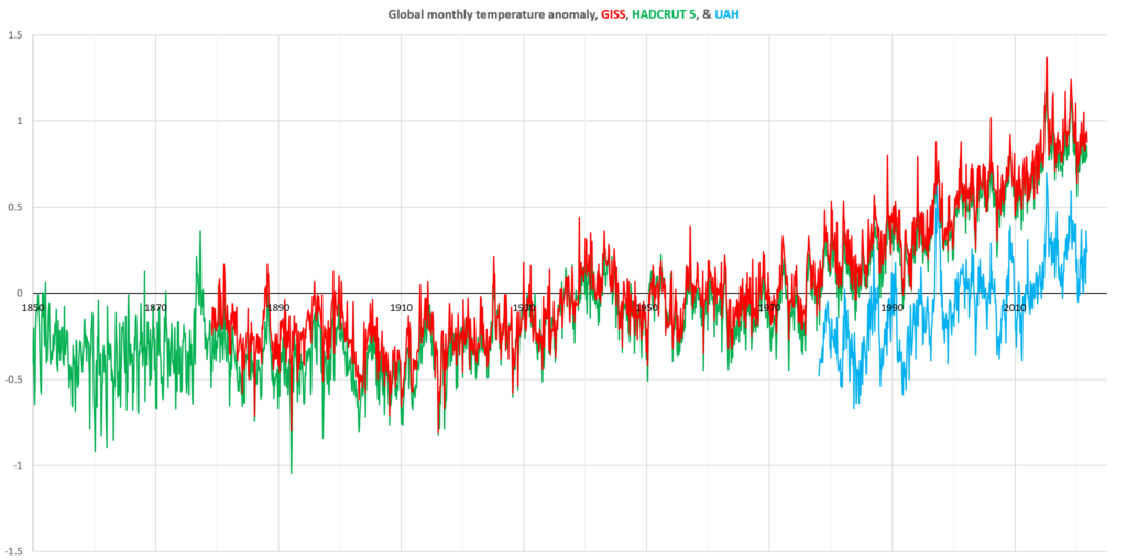
It is important to note that the vertical offsets between each series of data are caused by their using different baselines, not necessarily, or not because, they record different amounts of global warming. These series of data show temperature anomalies — relatively changes, not absolute temperature, and the baseline determines their vertical position. Warming can be seen in the change shown in each series. The UAH series starts much later than the GISS and HADCRUT5 series, and uses a different average to produce its baseline.
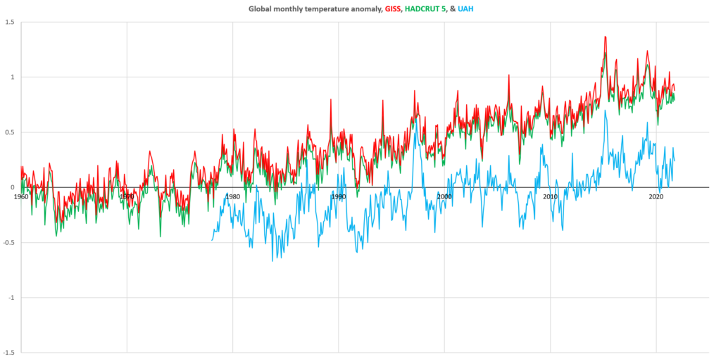
The current warming trend is shown more clearly in the following chart.
The satellite vs weather station data debate
The trends in the signals in the above charts do not show radical differences between them at first glance. However, when the noise of monthly variation is removed (using a 13 month moving average), a significant difference seems to emerge:
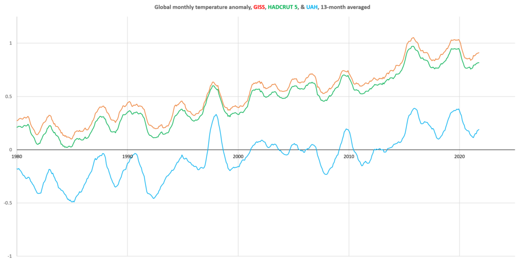
Whereas the temperature anomaly stands out and is slightly exceeded in the late 2010s in the UAH series, the HADCRUT5 and GISS series show much less warming in 1988 relative to the much more significant rise towards 2020. This has triggered a debate about which method of measuring the global temperature is the best.
The HADCRUT5 and GISS series were produced largely from ground-based weather station data, whereas UAH is produced from satellite measurement of the lower atmosphere’s temperature. Some argue that satellite measurement is more robust, since it is relatively consistent, and covers almost all of the globe equally, whereas weather stations are more unevenly distributed around the planet and requires significant processing.
Urban Heat Island (UHI) effect
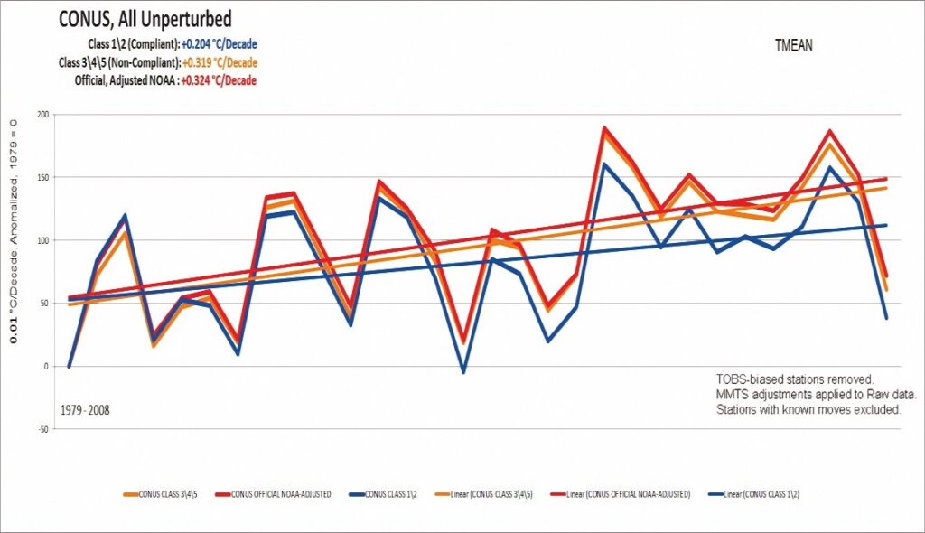
A similar controversy exists around the quality of data produced by ground-based weather stations, also known as surface stations. The problem is that some stations are poorly sited, which may lead to the contamination of the data they produce. For example, many of the UK’s record-breaking temperatures have been measured by surface stations positioned next to airport runways, leading to many headlines. Critics of the surface station record point out that large concrete structures and tarmac achieve much high temperatures than grassland or trees, and this introduces a false increase into measurements that amplify the appearance of warming that would not be present in a better-positioned station. Similarly, the last century, and in fact the era of thermometer readings has seen an extraordinary growth in the development of towns and cities throughout the world. Weather stations that used to be in the middle of fields are now situated next to buildings, near air-conditioning outlets, car parks and roads.
In the late 2000s, a crowd-sourced project in the USA aimed to identify as many surface stations as possible. This ‘citizen science’ project aimed to produce an independent evaluation of the quality of the network, based on the area surrounding the station. A 2022 report produced by the group’s organisers found that,
…approximately 96 percent of U.S. temperature stations used to measure climate change fail to meet what the National Oceanic and Atmospheric Administration (NOAA) considers to be “acceptable” and uncorrupted placement by its own published standards.
The study showed that stations which were improperly sited show significantly more warming than stations that were compliant with guidelines.
Paleoclimatology and the hockey stick
The first reliable thermometer was invented in the early 1700s, and recordings of temperature began shortly after. But even 300 years is a relatively short time in climate terms. Concerns that today we are seeing temperatures that are unusual or even unprecedented in human history require strong evidence from the past with which to compare. Rather than having thermometer readings from hundreds, thousands, and even millions of years ago, scientists have attempted to reconstruct past temperatures from proxy information, such as the size of tree rings, from sediments at the bottom of lakes, and from ice cores. This attempt to study prehistoric climate is known as palaeoclimatology.
Palaeoclimatology is not without its problems, as there exists no proof of temperatures in the far distant past by which to calibrate estimates. And this imprecision has made the field the subject of criticism. In the most notorious instance, the 2001 IPCC Assessment Report featured a chart showing reconstructions of past temperatures grafted onto data from the instrument record, to produce a ‘hockey stick’, as the image became known. This was used to seemingly demonstrate mankind’s ‘unequivocal’ effect on the climate. (This chart has since been used again in IPCC AR6, though to less media attention.)
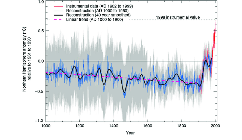
Sceptics have argued that the temperature reconstruction is unsafe, and was given undue prominence by the IPCC. The details of this complex debate are beyond a simple summary here, but can be found at the Climate Audit blog, by Steve McInTyre. A book offering an overview of the affair has also been produced, by Andrew Montford. The story remains one of the major controversies of the climate debate.
These same authors were also involved in a similar controversy following the leaking of emails between climate scientists in 2009, known as ‘Climategate’. According to interpretations of those emails, and among other things, the scientists discussed with each other how to conceal data that ran counter to the story they wished to emphasise in the hockey stick chart — “hide the decline”, as the story became known.
This article has very briefly outlined a small number of the major controversies around the subject of scientific measurements of the global temperature. These debates continue in various forms. Very few parties to these debates argue that there has been no global warming, or that anthropogenic greenhouse gas emissions are not responsible for observable warming, and neither they nor this article should be seen as making such claims. These debates are important to understand because both good science and good politics require independent criticism and dialogue. But unfortunately, some scientists have attached themselves to political positions, and heated political arguments have precluded open and transparent scientific debate. As Climategate emails revealed, researchers who should be able and willing to take part in good faith debates with people who disagree with them instead sought to close down the possibility of such debate, and to belittle critics rather than engage with their arguments.
Further links to both sides of these debates will be added below.